


This section presents the results structured into four main parts. First, we introduce the geographical area and datasets. Second, we evaluate travel-time accessibility under the current hospital distribution and under alternative configurations that optimize spatial distributions in the context of potential reductions in the number of hospitals. Third, we conduct a comparative analysis of the different configurations, using coverage-related indicators to evaluate their impact on accessibility. Finally, we examine how changes in hospital distribution affect accessibility patterns and demographic disparities, highlighting implications for equitable access to healthcare services.
Geographical, demographic, and transport landscape of Galicia
Study area and settlement patterns
Galicia, a region in northwestern Spain, covers 30,000 km2 and is home to 2.7 million inhabitants (Fig. 1a). This represents 5.5% of Spain’s population and 5.8% of its land area, with a population density of 91.3 individuals/km2—slightly below the national average of 95.340. Despite its modest population share, Galicia has a unique settlement structure, containing almost half of the total population units of Spain41.

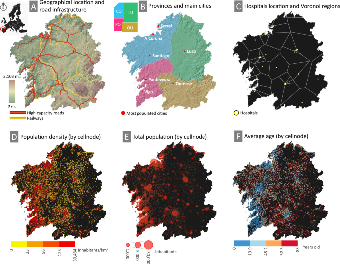
The upper panels present general data: A Geographic location, major transportation routes, and topography, displaying only high-capacity roads and railways, each with an approximate actual length of 1100 km. B Administrative division by province and location of the most populated cities. C Spatial distribution of hospitals and theoretical coverage based on the Voronoi diagram. The lower panels display data extracted from the population grid at the cell level: D population density by quantiles; E total population by node size; and F average age by quantiles.
Historically, the model of rural and agrarian settlement in Galicia featured dispersed populations clustered around small town centers serving as commercial hubs42. However, since the late 20th century, rapid urbanization has shifted populations toward the Atlantic Corridor along the western coastline. This corridor now includes five of Galicia’s seven major cities: Vigo and A Coruña (~300,000 residents each), Santiago, Ferrol, and Pontevedra (Fig. 1B). In the interior, only Ourense and Lugo (~100,000 residents each) remain significant urban centers, while suburban areas and former city centers have developed into medium-sized cities43.
The Atlantic Corridor dominates Galicia’s urban hierarchy, shaped by natural growth and migration of the working age population. Of the four administrative provinces of the region, it crosses the two most populous: A Coruña (1.1 million residents) and Pontevedra (936,000). On the other hand, Lugo (290,000) and Ourense (291,000) experience the opposite trend, with depopulation and an increasingly elderly demographic. Eastern Galicia is particularly affected, with smaller and dispersed population nodes and an increasing average age further from urban centers. In general, seniors (65 years and older) represent 26.1% of the total population of Galicia, with the largest proportions in Lugo (29.9%) and Ourense (31.9%), compared to A Coruña (25.5%) and Pontevedra (23.6%)40.
These spatial patterns have direct implications for accessibility to the healthcare system. Although urban areas benefit from concentrated healthcare services, rural and aging populations face longer travel times and limited mobility, exacerbating spatial inequalities in hospital access.
Demographic distribution and population data set
The Galician Statistical Office provides high-resolution population census data using a 1 km2 grid, consisting of 30,773 cells44. Among these, 10,545 cells are populated, with an average of 248 residents per cell. Since the grid does not perfectly align with administrative boundaries, 2228 cells were cropped to improve geoprocessing precision and computational efficiency.
Each grid cell contains total population data and age distribution in three groups: young (under 16 years), adults (16–64), and elderly (over 64). Of the 10,545 populated cells, 6356 report young population data, 934 of which have a value of 0; 9550 contain adult population data; and 7181 include elderly population data, with 2 having a value of 0. The remaining cells either have incomplete information or data are not available for cells with fewer than 20 residents or age groups to comply with the European General Data Protection Regulation (GDPR)45.
In general, the grid captures 90.9% of the total population of Galicia, although the representation varies by age group: 95.5% for young people, 92% for adults, and 86.2% for elderly46. The representation is higher in the western provinces, A Coruña and Pontevedra, where it exceeds 90%, while in the eastern provinces, Lugo and Ourense, it is lower at 75.1% and 83.2%, respectively. The representation of older people is particularly uneven, ranging from 94.2% in Pontevedra to 66.4% in Lugo (Table 1). A visualization of selected parameters from this data set is shown in Fig. 1D–F.
Healthcare infrastructure and hospital facilities
Healthcare services in Galicia are structured into seven distinct zones according to potential demand, proximity to medical facilities and demographic and political-administrative criteria. The eastern provinces, Lugo and Ourense, each form a single healthcare zone, while the more densely populated western provinces are divided into five smaller zones. Hospitals form the backbone of the regional healthcare system, offering emergency services and specialized care 24/7. The region has 79 hospitals, mainly concentrated in urban areas, particularly along the Atlantic Corridor, where the population density is the largest47. The service areas of these hospitals can be delineated through various methodologies such as the Voronoi diagram, the Gravity model, the Huff model, and more sophisticated approaches incorporating service flows between areas48 to define functional regions more precisely.
For a theoretical estimation of hospital service areas, the Voronoi diagram provides a valid methodology49. This method divides the region into distinct areas, each centered around a hospital, ensuring that any point within a given area is closer to its respective hospital than to any other. Given two nodes, a = (ax, ay) and b = (bx, by), the Euclidean distance is \(d(a,b)=\sqrt{{({a}_{x}-{b}_{x})}^{2}+{({a}_{y}-{b}_{y})}^{2}}\). This extends to a set of input data corresponding to a point grid, where A = {a1, a2, …, an}, with n being the total number of points in the plane. Although simple, this method provides a clear and straightforward approach to defining service areas based solely on proximity criteria.
The set of all points closer to ai ∈ A than to any other aj (j ≠ i) defines the Voronoi cell Va(ai) of ai, expressed as
$${V}_{a}({a}_{i})=\{b\in {{\mathbb{R}}}^{2}| d(b,{a}_{i}) < d(b,{a}_{j}),\forall j\ne i\}$$
(1)
The complete Voronoi diagram Vor(A) of A is then defined as the collection of all Voronoi cells:
$$\,{\rm{Vor}}\,(A)=\{{V}_{a}({a}_{i})| i=1,2,\ldots ,n\}$$
(2)
In this case study, the region is divided into 79 Voronoi polygons, each representing the theoretical service area of an individual hospital. A clear spatial trend emerges where the polygon size progressively increases toward the easternmost sector, corresponding to the least populated areas. In contrast, smaller polygons are concentrated around densely populated urban centers, reflecting the largest densities of healthcare facilities in these areas. This spatial distribution not only reveals the impact of population density on the accessibility of healthcare services but also provides a clear and intuitive framework to understand how hospital services are distributed and their implications for different communities (Fig. 1C).
Transportation network and road classification
The dataset, gathered from the Spanish Center for Geographic Information (CNIG)50, compiles the complete road infrastructure of the region. Roads are classified into five categories based on capacity and maximum allowed speed: highways and highways, multilane roads, conventional roads, urban roads, and rural roads. Estimated theoretical speeds align with legal limits: 120 km/h for roads, 100 km/h for multilane roads, 90 km/h for conventional roads, 50 km/h for urban roads, and 30 km/h for rural roads.
This dataset covers over 160,372 km of the road network, a figure significantly higher than the actual length due to the duplication of certain categories where one-way segments are represented separately. By category, highways account for 3.6% of the network, multilane roads 0.26%, conventional roads 20%, urban roads 11.5%, and rural roads 64.5%. The large proportion of rural roads reflects the widespread dispersion of the population. Data are provided in geospatial format, with 908,883 linear features representing the different road categories, maintaining similar proportions to their total length. Table 2 summarizes the dataset, detailing the number and total length of each category of roads, along with the number of polyline features for GIS analysis.
Assessing travel time accessibility
This subsection assesses the regional accessibility to hospitals based on travel times, using the current distribution as a baseline scenario (Scenario S0). We then examine the effects of progressively reducing the number of hospitals, from maintaining the full network to a critical reduction of up to 75%. In total, four scenarios are proposed (Scenarios S1–S4), through which we identify the optimal spatial configuration to enhance accessibility under each condition.
Scenario S0
We assess the regional accessibility to the 79 officially documented hospitals, defined as Scenario 0. These hospitals are primarily concentrated in or near densely populated urban centers. Figure 2 shows current travel times based on the existing road network. Accessibility is represented through 1-minute isochrones up to a 30-min threshold, which serves as the critical reference point. A color gradient from blue (shorter travel times) to red (longer travel times) highlights variations within this range, while areas exceeding the 30-min threshold are shown in black.


Scenario S0 represents the current state, while Scenario S1 corresponds to an optimized configuration maintaining the same number of hospitals. While hospital facility numbers vary across scenarios, the number of population nodes remains constant. Although the networks visually represent Euclidean distances, actual distances are computed based on the road infrastructure. These panels also depict Voronoi boundaries, illustrating the number of hospitals and their theoretical service areas.
The major cities and their metropolitan areas, along with several intermediate urban centers, demonstrate high accessibility. These intermediate cities include suburban hubs near large metropolitan areas and traditional capital cities serving surrounding rural populations. However, extensive regions, particularly in the east and south, as well as isolated pockets elsewhere, face limited accessibility, with travel times exceeding 30 min.
Almost half of the population lives within a 5-min drive to a hospital. However, accessibility varies by age: only 44.1% of elderly people fall within this range, compared to 48.8% of young people and 47.9% of adults. At the 30-min threshold, elderly people (4.3%) is disproportionately affected compared to young people (1.8%) and adults (2.6%). In absolute terms, 76,291 people, including 28,545 over 64 years-old, live beyond this critical limit. It is also worth noting that as travel times extend beyond 10 minutes, the proportion of the elderly population among the affected population increases.
Scenario S1–S4
We assess regional accessibility by analyzing a series of potential scenarios. These scenarios, numbered S1–S4, involve progressively reducing the number of hospitals while optimizing their spatial configuration to minimize travel times. Scenario S1 retains all 79 hospitals, but improves their distribution. Scenarios S2–S4 gradually reduce capacity to 75%, 50%, and 25% of the current level, with 59, 40, and 20 hospitals, respectively. These changes impact both travel times and hospital service areas, as reflected in variations of the Voronoi diagram. Figure 2 shows a comparative analysis across scenarios.
Optimizing hospital locations in Scenario S1 significantly improves accessibility by reducing critical areas and shrinking regions beyond the 30-minute threshold while expanding shorter travel times, as indicated by the increased presence of blue tones across the region. Only 0.1% of the total population (2314 individuals) and 0.2% of the elderly population (1082 individuals) remain beyond this threshold, with the largest improvements observed in intermediate areas outside major cities. However, low-accessibility areas predominantly persist in the central and eastern parts of the region.
As hospital numbers decline in subsequent scenarios, accessibility vulnerabilities become more pronounced in these areas. The provinces of Lugo and Ourense experience the most significant impacts, although other regions also see reductions in accessibility. Critical areas expand exponentially, and Voronoi polygons grow larger, reflecting increased distances to the nearest hospital.
An analysis by age composition highlights improvements in social equity. In the current configuration, the elderly population is disproportionately affected by longer travel times. Scenario S1 reverses this trend for travel times greater than 20–25 min. Although subsequent scenarios introduce some fluctuations, the proportion of older adults in critical areas remains relatively stable at around 30–40%. This slightly exceeds their overall regional proportion, 28.7% in this dataset44—26.1% according to the official population census published by the Galician Statistical Office46—reinforcing a consistent pattern: As the distance from the hospital increases, the share of older residents also increases.
Comparative accessibility across scenarios
The optimization of hospital locations leads to substantial improvements in accessibility in all key indicators. Figure 3 presents aggregated data in 1-min travel time intervals, providing granular information on accessibility patterns. The results indicate that Scenario S1 significantly improves accessibility compared to the current configuration (Scenario S0) by reducing the extent of critical-time areas and shortening travel times, allowing a larger fraction of the population to benefit from intermediate travel times.

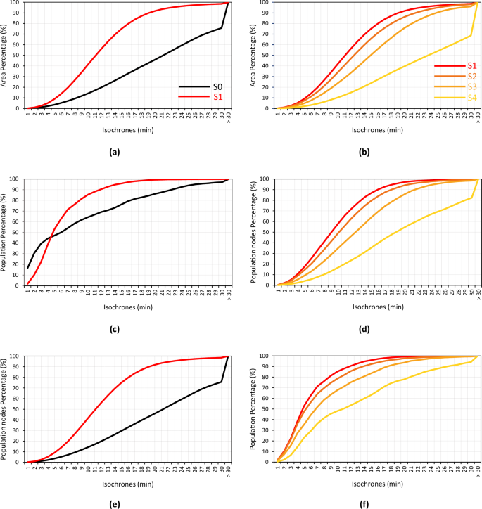
The X-axis represents travel times (in minutes), and the Y-axis displays the cumulative percentage of each indicator (area, population nodes, and total population) for each travel time interval. Left panels: Results for Scenarios S0 and S1. Right panels: Results for Scenarios S1–S4.
The comparison between scenarios S0 and S1 highlights significant accessibility improvements in multiple dimensions. The total covered area expands by 22.8% (from 75.7% to 98.5%), the number of population nodes served increases by 10.9% (from 88.7% to 99.6%), and the total population reached increases by 2.8% (from 97.1% to 99.9%). These improvements are particularly pronounced at intermediate travel times. For example, at the 15-min mark, the covered area expands by 45.4% (from 29.6% to 75%), the number of population nodes increases by 40.9% (from 46.1% to 87%), and the total population served increases by 19.7% (from 76.2% to 95.9%). The only exception occurs within the first four minutes, where Scenario S0 slightly outperforms S1 in terms of total population coverage. However, beyond this threshold, Scenario S1 consistently offers greater coverage in all indicators.
As the number of hospitals is progressively reduced from Scenarios S1–S4, accessibility declines, though the effects remain moderate in the early stages. Scenarios S1–S3 maintain relatively stable performance with manageable reductions in service levels. However, in Scenario S4—where hospital numbers drop to just 25% of the current level—accessibility sharply deteriorates. The patterns in S4 closely resemble those in S0, particularly in terms of area coverage and the number of population nodes served. This suggests that drastic reductions in hospital infrastructure lead to severe service degradation, reinforcing the importance of optimized spatial redistribution to ensure equitable access to healthcare.
A direct comparison of distances and travel times provides a more comprehensive analysis. Euclidean distances between each population node and the nearest hospital are estimated based on the spatial network topology defined for each scenario, as illustrated in Fig. 2. A summary of results for the entire region across all scenarios is presented in Fig. 4. Scenarios S0 and S4 exhibit strikingly similar performance, particularly in terms of distance, and both perform significantly worse than the intermediate scenarios. These findings highlight the crucial role of optimizing hospital distribution to improve healthcare access and minimize disparities.

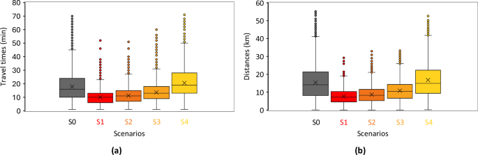
The left column shows travel times (a), and the right column shows Euclidean distances (b). Results by scenarios are represented by rows, while results by provinces are displayed sequentially in ascending order within each individual chart.
Regional and demographic disparities in accessibility
A provincial breakdown highlights substantial disparities in healthcare access, with Lugo and Ourense emerging as the most vulnerable regions. Under the current hospital distribution (Scenario S0), these provinces have the highest proportions of residents who live beyond the 30-min isochrone: 4.9% in Lugo and 6.4% in Ourense, compared to 3.5% in A Coruña and Pontevedra. The situation is even more critical for the elderly population, with 6.5% in Lugo and 9.5% in Ourense residing beyond this threshold. These figures far exceed those of other provinces, highlighting the increased accessibility challenges these regions face.
Optimizing hospital locations in Scenario S1 leads to a significant reduction in disparities in all provinces, with the most notable improvements observed in Lugo and Ourense. The fraction of the population living beyond the 30-minute threshold drops to ~0.1% in these provinces, while in A Coruña and Pontevedra, the residual values remain slightly higher, ranging from 0.2% to 0.4%. This trend is also observed in Scenario S1, which improves accessibility for older populations. Figure 5 shows that scenarios S1 and S2 consistently improve both distances and travel times in all provinces, promoting greater equity. Scenario S3 continues this trend, with particularly noticeable improvements in Ourense. However, Scenario S4 highlights vulnerabilities in all provinces, although A Coruña remains the least affected. Despite Lugo exhibiting the highest Euclidean distances in all scenarios, these distances do not always correlate with longer travel times, suggesting differences in network efficiency.

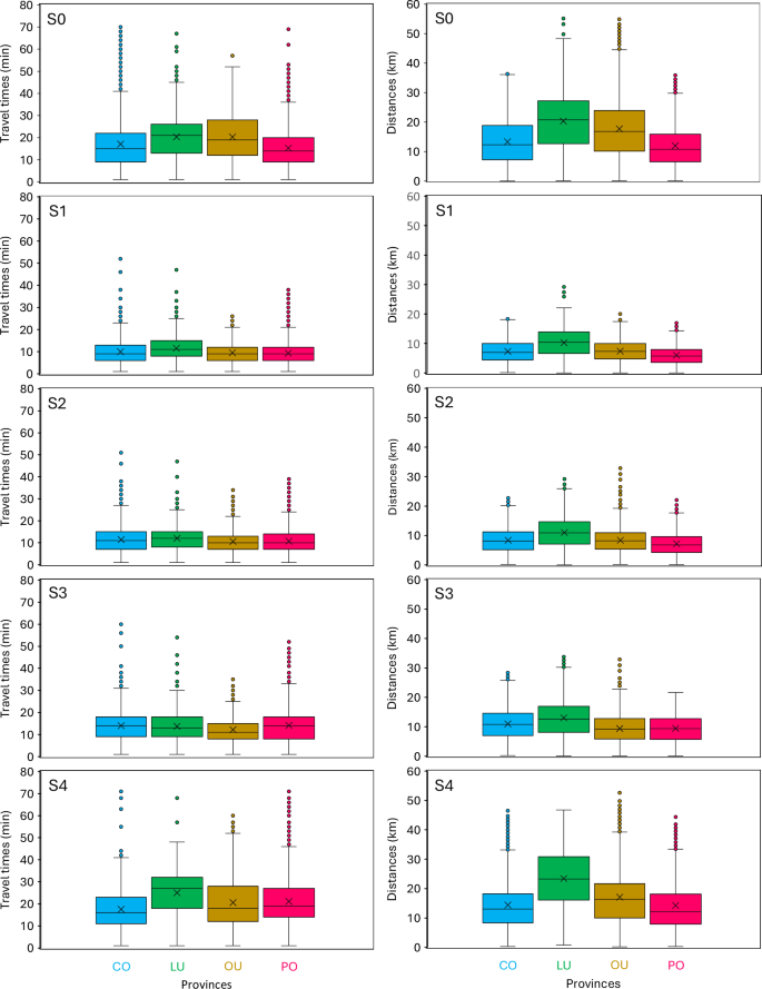
Left: Travel times; Right: Euclidean distances. Results for each scenario are displayed sequentially in ascending order.
In all scenarios, elderly populations remain disproportionately represented in critical access areas. In Lugo province, 29.9% of the total population is elderly, compared to 31.9% in Ourense46, with slightly lower figures in the point grid dataset (28.2% and 31.1%, respectively)44. However, in Scenario S0, the proportion of elderly residents in critical areas increases to 37.6% in Lugo and 46.4% in Ourense, indicating the heightened vulnerability for this age group. Although no scenario fully eliminates this disparity, all optimized configurations result in significant reductions. Even in the most constrained scenario (S4), the proportion of elderly residents in critical areas drops to 33.1% in Lugo and 37.2% in Ourense. This demonstrates that an optimized redistribution of hospitals can significantly improve healthcare access for the elderly population, achieved solely through a reconfiguration of existing resources. Figure 6 offers a detailed breakdown of age-group disparities across all provinces and scenarios, while Table 3 provides a comprehensive summary of the supporting data and visualizations.

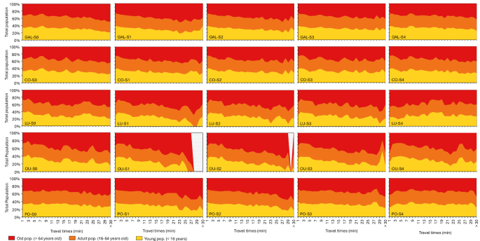
The X-axis represents travel times (minutes), while the Y-axis indicates the population percentage within each age group for each travel time interval. Results by administrative regions (i.e., Galicia or individual provinces) are represented by rows, while results by scenarios are displayed sequentially in ascending order across columns.
link